Digital
transformations.

Four Eastern North Carolina businesses — two built from zero online presence, two redesigned from the ground up. Here's how we did it.

Case study 01 · Digital transformation

Building trust & modernizing in-home care access.

ClientRapture Ready Home Care
IndustryIn-home senior care
LocationJacksonville, NC
PartnerTruly Digital Solutions
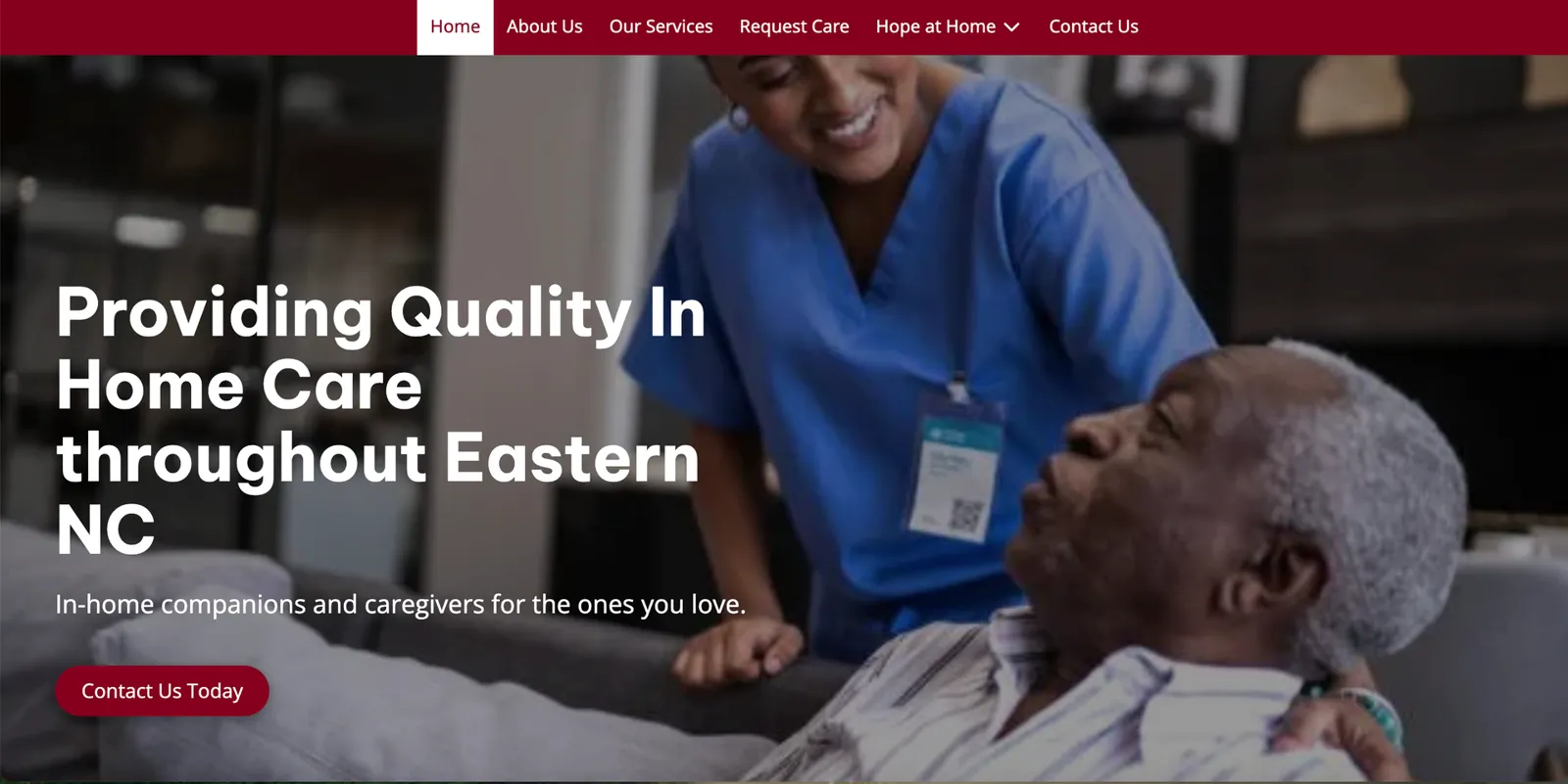
Rapture Ready Home Care homepage: Providing quality in-home care throughout Eastern NC
Executive summary

A blank digital slate, turned into a high-trust platform.

Rapture Ready Home Care provides trusted in-home caregiving to seniors and individuals recovering from illness or injury in Jacksonville, NC. To bridge the gap between their exceptional hands-on care and the digital-first families searching for it, we engineered a comprehensive digital transformation.

The result: instant professional legitimacy, less friction for families in high-stress situations, and leaner day-to-day administrative operations.

The challenge

The vulnerability of invisible local care.

  • The trust deficitFamilies had no independent way to verify credentialing, insurance compatibility or safety standards before calling.
  • Administrative strainStaff spent valuable hours on repetitive screening calls to filter insurance mismatches and out-of-area inquiries.
  • Friction in crisisAdult children managing a sudden family emergency couldn't find or contact the business quickly — especially after hours.
The solution

Less brochure. More operational tool.

01

Trust architecture

Screened caregivers, verified testimonials and a dedicated credentials section put transparency up front.

02

Frictionless pathways

A prominent "Request Care" path and direct contact forms minimize the steps for a worried family to get help.

03

Community resource hub

A senior events calendar, a "Nurses Corner" and a "Tech Savvy" section make the brand a local asset.

04

Lead pre-qualification

Publishing their NPI and accepted insurances turns the site into a passive filter that saves hours of phone screening.

Results

Strategic impact.

  • Operational efficiencyNPI and clear insurance verification remove time-consuming administrative bottlenecks over the phone.
  • Brand positioningElevated from a local agency into an interactive, vital community resource.
  • ConversionDirect "Request Care" pathways lower friction and fast-track intake for families under stress.

The brand is no longer just a service provider — it's an integrated community asset that filters its own inquiries.
Case study 02 · Digital transformation

Driving trust & scalability for Faithful Rides LLC.

ClientFaithful Rides LLC
IndustryNEMT services
LocationJacksonville, NC
PartnerTruly Digital Solutions
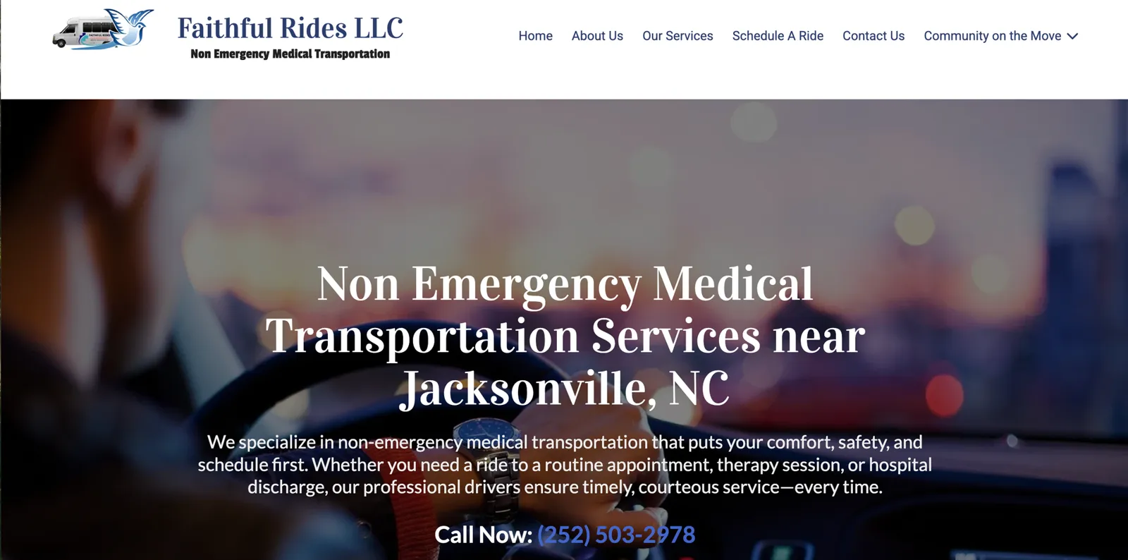
Faithful Rides LLC homepage: Non-emergency medical transportation services near Jacksonville, NC
Executive summary

An authoritative "front door" for a vital local service.

Faithful Rides LLC is a veteran-owned, family-oriented non-emergency medical transportation (NEMT) provider delivering door-to-door transit for seniors, individuals with disabilities and patients requiring care. Without an online footprint, they relied entirely on word-of-mouth and manual cold calling.

We built a comprehensive web platform that replaces consumer hesitation with institutional trust and unlocks modern operational scalability.

The challenge

The friction of an offline model.

  • High barrier to entryClients and healthcare facilities had no public resource to verify safety standards, service parameters or values.
  • Administrative strainStaff spent hours on the phone confirming service boundaries, insurance compatibility and onboarding new riders.
  • Friction for caregiversFamilies and medical advocates had to make high-pressure calls in narrow business hours just to get basic information.
The solution

A frictionless, high-trust storefront.

01

Institutional trust

Veteran-owned, family-operated values and verified testimonials front and center to replace the uncertainty of "hiring a stranger."

02

Streamlined logistics

Clear layouts, intake forms and transparent service overviews let families and partners review, verify and request rides.

03

Education as a service

An insight-driven newsroom — like Medicare vs. Medicare Advantage guidance — positions the brand as an authority.

04

Built to scale

Precise service areas and specialized intake workflows pre-qualify inquiries before they ever reach staff.

Results

Strategic impact.

  • Operational efficiencyInbound inquiries are pre-screened by service area, substantially cutting phone overhead.
  • Brand positioningElevated from a local transit provider to a trusted, HIPAA-aware hub in the care ecosystem.
  • Client experienceFrictionless 24/7 digital intake for busy families and professional care managers.

Going from zero presence to a strategic storefront isn't just visibility — it's operational infrastructure.
Case study 03 · Website redesign

A calm, trustworthy home online for Just 4 Kids.

ClientJust 4 Kids Drop-In Child Care
IndustryChild care
LocationJacksonville, NC
Live atjust4kidsinc.com ↗
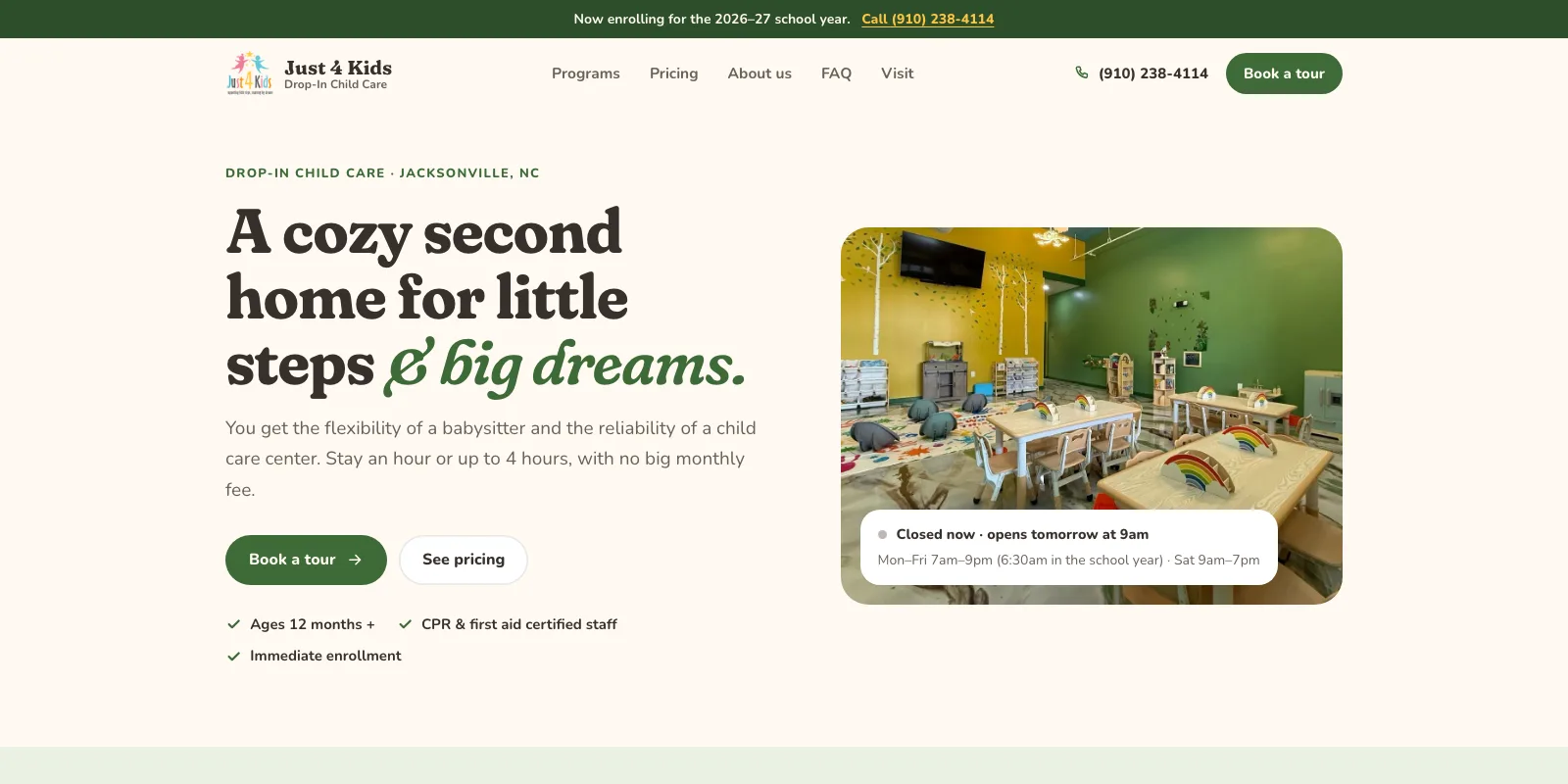
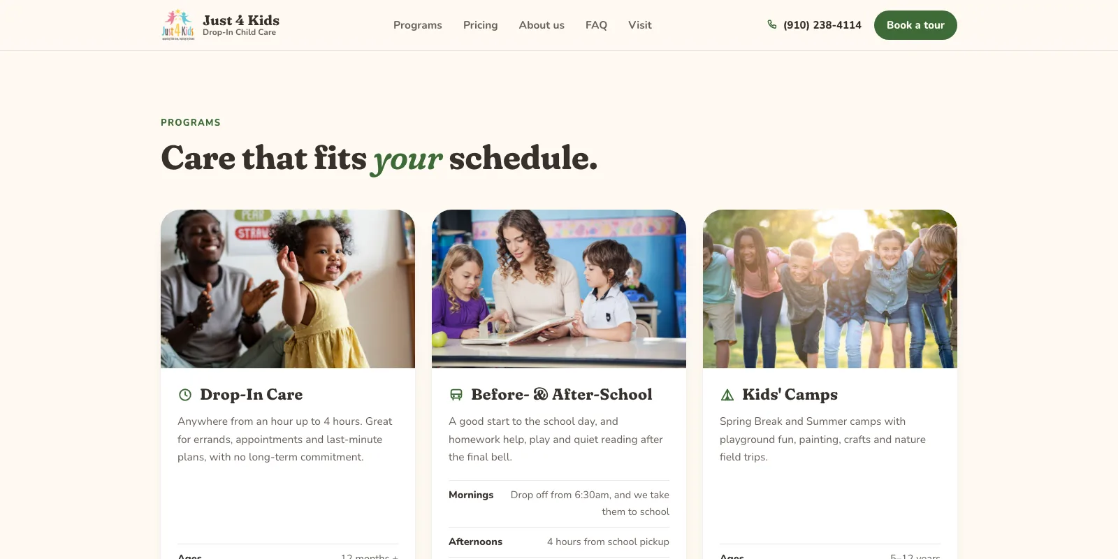
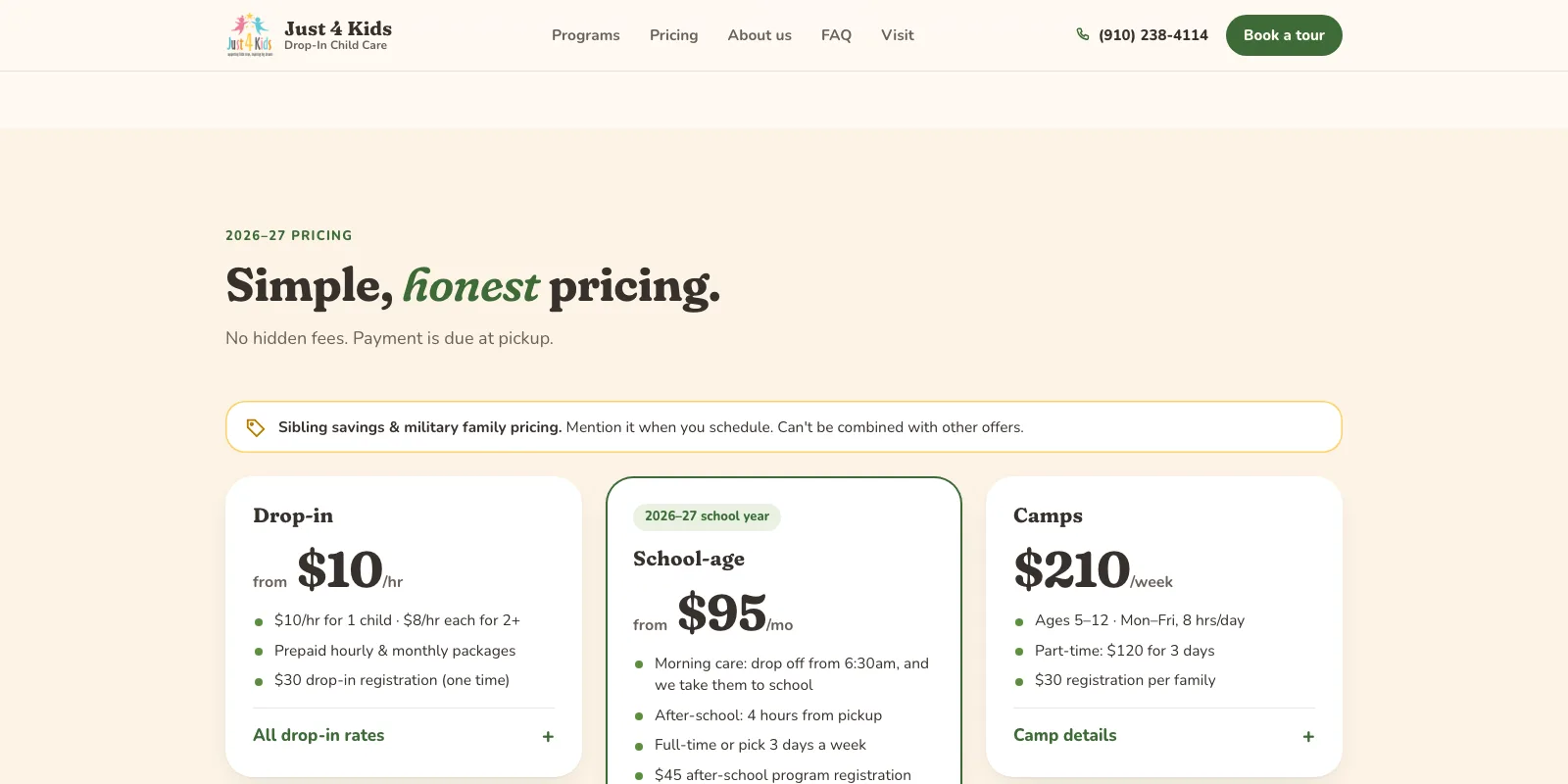
After: the redesigned Just 4 Kids homepage with a cozy playroom photo, clear hours and a Book a tour button
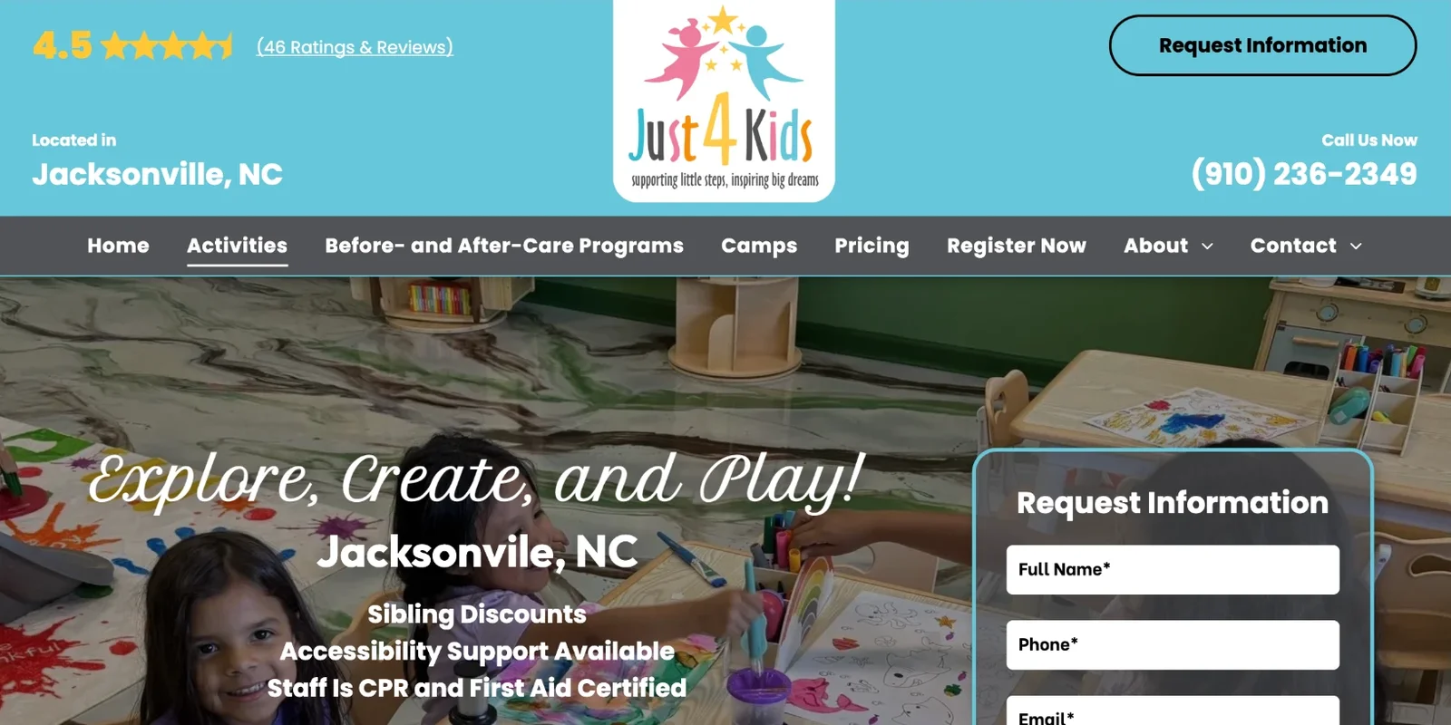
Before: the previous Just 4 Kids template website with a crowded header, a busy photo hero and an older phone number
BeforeAfter
Executive summary

Everything a parent needs, in one calm place.

Just 4 Kids is a small drop-in child care center offering hourly care, before- and after-school programs and seasonal camps. Parents choosing care need two things fast: confidence their child is safe, and clear answers on hours and cost.

We rebuilt the site from the ground up as a warm, uncluttered experience — cream, white and sage with a single green accent — that puts safety, schedules and honest pricing front and center.

The challenge

Scattered, conflicting information.

  • Mixed messagesThe old site, flyers and listings disagreed on basics — the main phone number, the unit number and hours — with three different numbers in circulation.
  • Pricing questions by phoneDrop-in rates, packages, school-age plans and camp fees weren't laid out anywhere parents could compare them.
  • Trust at first glanceParents had no quick way to see safety measures, staff certifications or what a day looks like before calling.
The solution

Designed with the owner, refined to calm.

01

Safety promise up front

CPR & first aid certified staff, a controlled entrance, security cameras and small-by-design attention — right after the hero.

02

Honest, complete pricing

Drop-in rates, hourly and monthly packages, school-age plans and camps in expandable tables, plus sibling and military pricing.

03

A school-year calendar

A 2026–27 planner built from the official Onslow County Schools calendar shows breaks, workdays and camp weeks at a glance.

04

One source of truth

One phone number, the correct address, a live open/closed status with school-year early hours, online registration and a tour request form.
Impact

Strategic impact.

  • Parent confidenceSafety measures and certifications are the first thing families see after the welcome.
  • Fewer phone questionsHours, rates, packages and school-year dates are answered on the page.
  • Consistent brandOne phone number, one address and one calm visual identity across the site.

The flexibility of a babysitter with the reliability of a child care center — and now the website says so clearly.
Case study 04 · Website redesign

Giving Fly Bodies Fitness a site that flies.

ClientFly Bodies Fitness
IndustryBoutique fitness studio
LocationJacksonville, NC
PartnerTruly Digital Solutions
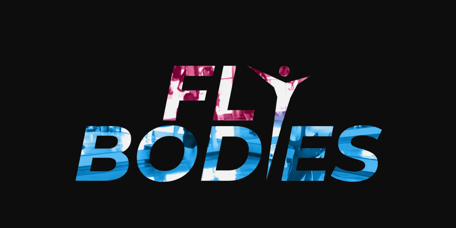
After: the redesigned Fly Bodies homepage with studio video playing inside the giant Fly Bodies logo
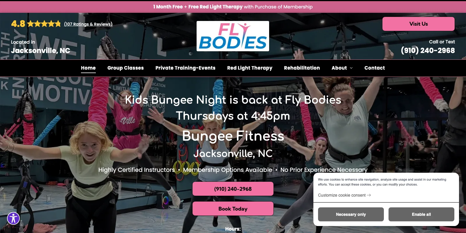
Before: the previous Fly Bodies template website with a crowded header, stacked text and a cookie banner
BeforeAfter
Executive summary

An experience as bold as the workout.

Fly Bodies Fitness is a local, woman-owned studio offering bungee fitness, rehab bungee, red light therapy and Zumba. Their previous template site listed the right information, but it looked like every other gym — and never captured the thrill of actually flying.

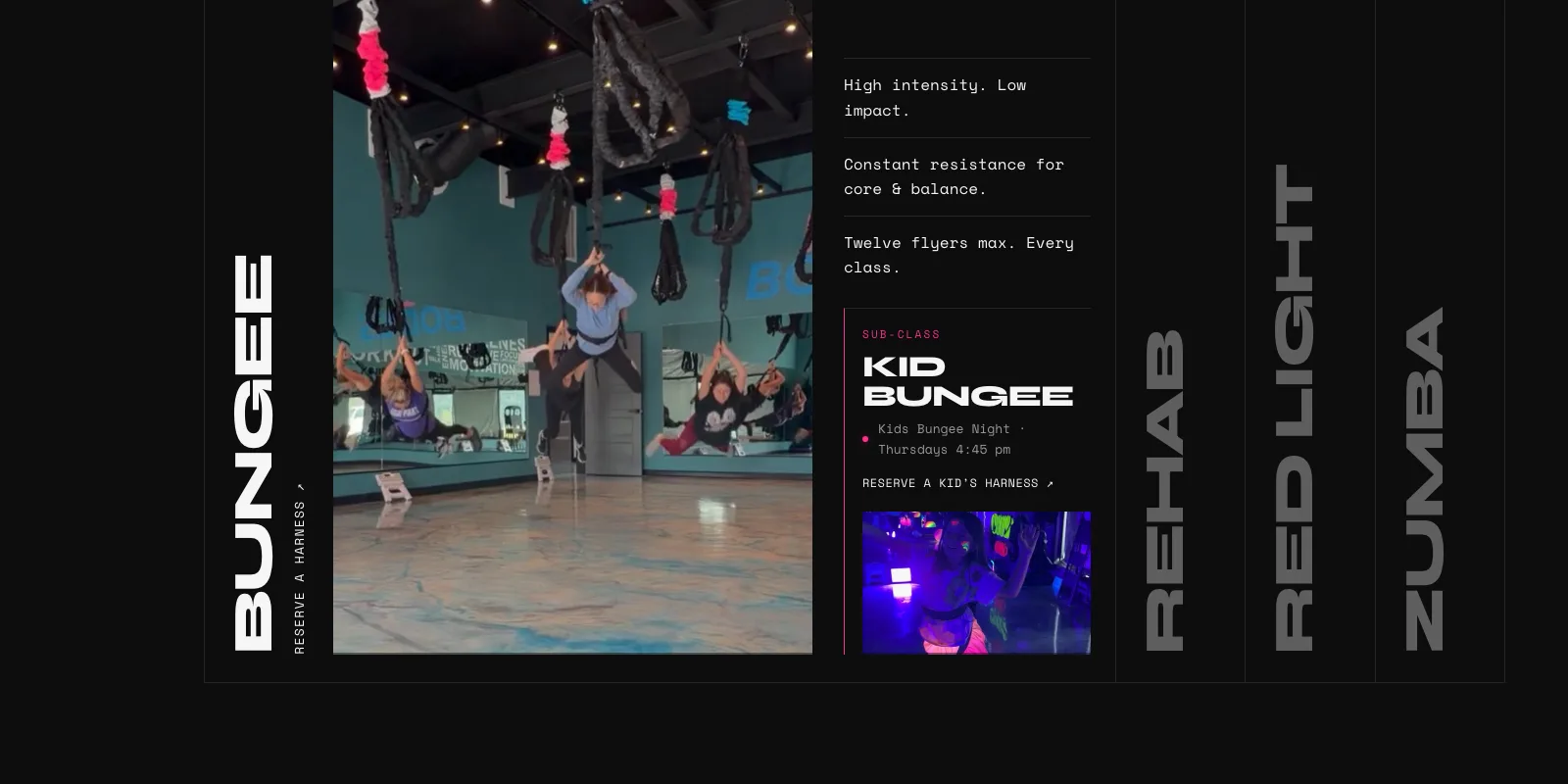
We designed a cinematic, dark-mode experience in the brand's pink and blue: studio video playing through the Fly Bodies logo, one clear path to book, and every class explained in seconds.

The challenge

A one-of-a-kind studio on a one-size-fits-all template.

  • Crowded first impressionRatings, logo, buttons, phone number, a seven-item menu and a cookie banner all competed for attention above the fold.
  • Four services, no storyBungee, rehab, red light and Zumba lived on separate pages, so visitors couldn't compare them or see which fit.
  • Booking frictionNewcomers had to hunt for the intro offer, hours and class schedule before they could commit.
The solution

Motion-first, built to convert.

01

A cinematic hero

Real studio footage plays inside the giant Fly Bodies logo, with smooth scrolling and text that reveals as you move.

02

"Four ways to fly"

An expanding panel for Bungee, Rehab, Red Light and Zumba — each with video, three key facts and a booking link, plus Kid Bungee Night.

03

First Flight Week

A $55 intro week and the current membership promo sit front and center, so first-timers know exactly how to start.

04

Studio vitals

A live open/closed status, hours, directions, a two-week day picker linked to Vagaro booking, and a floating FAQ.
Impact

Strategic impact.

  • Brand positioningA premium, memorable experience that matches the energy of the studio.
  • Clear discoveryAll four disciplines explained side by side, with video, in a single scroll.
  • ConversionIntro offer, live hours and booking are never more than a tap away.

The site finally feels like the class does — high intensity, low impact, and impossible to forget.

Free · 15 minutes · No obligation

Let's see what
your site is leaving
on the table.

Request a free technical site audit or a no-obligation design demo. If you don't love it, you pay nothing.

Request my free audit or call (561) 971-9512